
Knowing how to effectively analyse pricing trends is one of the most important skills for a trader to develop. That’s why it’s critical for traders to learn how to read price charts.
Just like we all need to learn how to read the alphabet before we’re able to write, traders learn how to read price charts before they learn how to trade. Price charts are a traders’ best tool for tracking and identifying pricing trends.
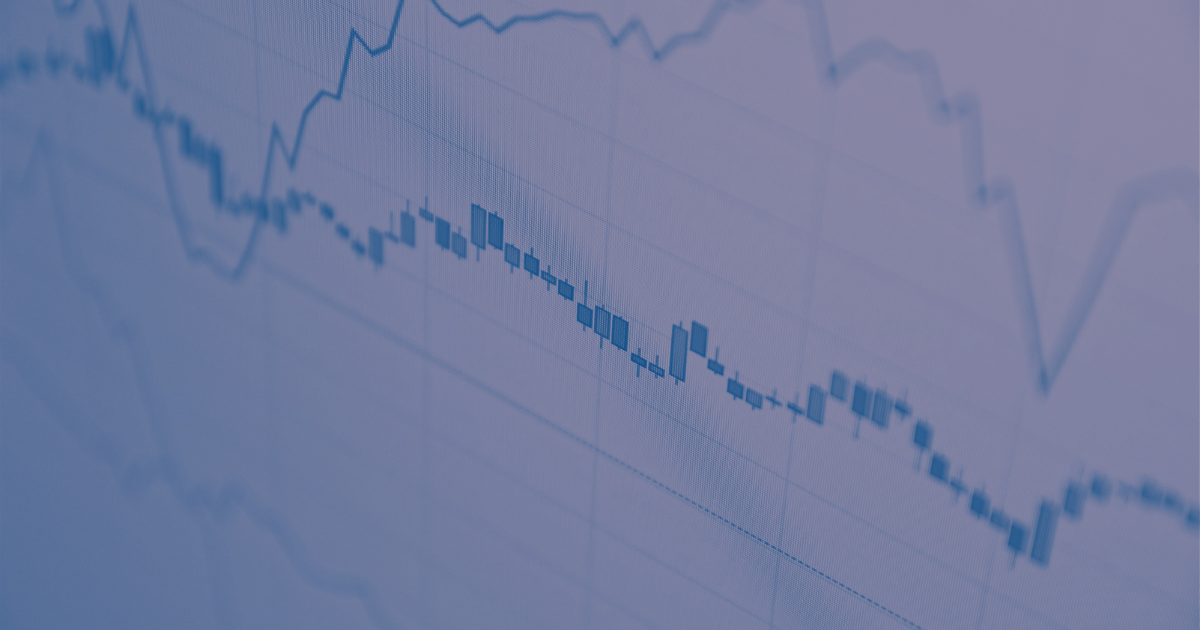
There are many types of price charts. Three of the most widely used are candlestick, bar, and line charts. Other charts include volume charts, tick charts, Renko charts, Kagi, and more.
For this article, we’re going with a Japanese theme, by taking a quick look at two types of price charts that originated in Japan; Candlestick charts and Renko charts.
Candlestick charts
A candlestick chart (also called Japanese candlestick chart) is one of the more popular price charts among traders, because they include more information in a single view than almost any other type of price chart shows.
When you look at a candlestick you can instantly see four price points for that asset (open, close, high, and low) for the time period you specify.
By reading those price points, you’re able to tell an asset’s opening and closing values, its current direction trends, and the high and low price for each reporting period.
Candlestick charts use vertical bars to show high and low prices, called “wicks”. The thicker portion in the candlestick is called the “real body”. It shows the asset’s open and close prices for the day.
You’ll notice that some candlesticks are hollow (not filled out) and others are filled out. The difference is pretty simple. The hollow candlesticks mean the asset has moved higher after it’s open. While the filled-out candlestick tells us the asset has moved lower after it’s open.
A candlestick chart is made of patterns created when there are price movements in the market over time. Doji, spinning tops, shooting star, are all names for these candlestick patterns. You’ll become more familiar with them the more deeply you delve into candlestick charts.
Renko charts
Renko charts are simpler price charts to read mainly because they’re designed to filter out minor price movements so that you can more easily see important trends.
They were likely named after the Japanese word for bricks, ‘renga’, because that’s what these charts are made up of – a series of ‘bricks’.
A new brick is formed when a fixed amount of price movement has occurred.
Building a Renko chart starts with selecting what is called a ’box size’ that represents the magnitude of price movement. The chart prints a new brick on the chart once the price has surpassed the top or bottom of the previous brick by the box size amount. Subsequently, all movements that are smaller than the box size are filtered out.
Renko charts are brilliant at filtering out the noise, but because they don’t use fixed time intervals as candlestick charts do, they don’t display the exact price action of an asset over a specific time period. Several bricks could form in a single day, or they could take weeks or months to form. As a result, a lot of important price information could be missed.
That’s why it’s always a good idea to use Renko charts as a compliment to another price chart that offers a more detailed look at the market, like candlestick charts. That way you can get a broader and clearer idea of how the market is trending overall.